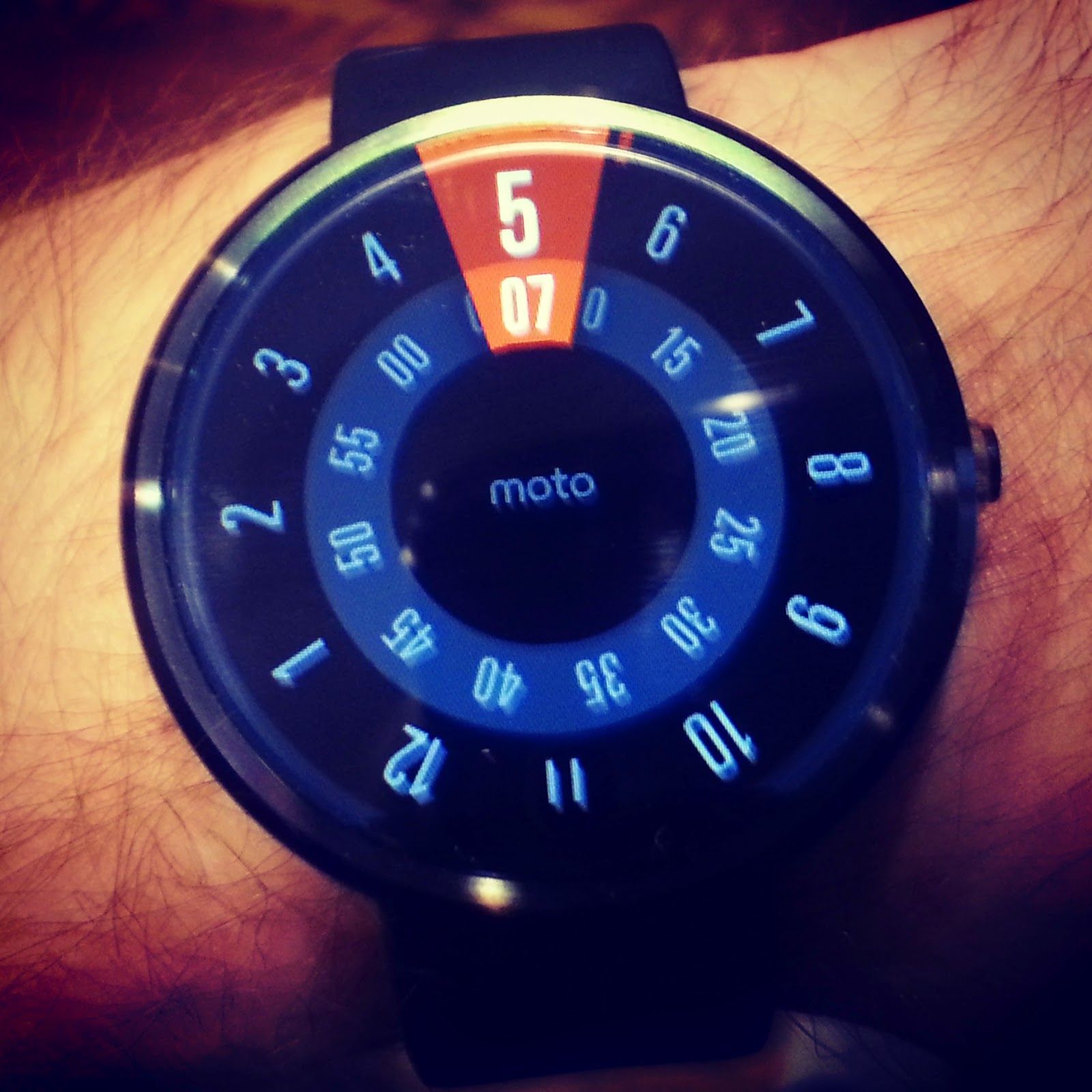
In the interest of upping my weekly word count and changing things up a bit, I thought I’d scribble a few thoughts on the technology I use daily (for both work and pleasure). To start things off, let’s talk Moto360 and Android Wear.
I’ve been a Pebble owner for well over a year. I started with the original pebble, upgraded to the pebble steel, then reverted to the original pebble. Sure, the Steel was constructed of better materials and had a nifty black metal band, but it was also blockier and didn’t sit as well on my wrist. The seating issue meant I rarely felt the watch vibrate. If you can’t feel the watch vibrate, you don’t know you have a notification, and if you don’t know you have a notification, what’s the point of a smartwatch?
I happen to enjoy seeing notifications on my wrist. They’re not essential. Life won’t stop without them. Nobody needs a smartwatch. But once you grow accustomed to flicking your wrist to see the cause of some new vibration, the act of pulling out your phone almost becomes tiresome.
Truth be told, I was happy with my Pebble. So why the Moto360? One, it’s prettier. Two, it’s prettier. Three, Android Wear, which promises far richer experiences than pebble’s operating system can offer. The integrations with Android and Google Now are fantastic. I love the Google Now cards on my wrist throughout the day. Plus, the app notifications work without requiring third party tools (like Pebble).
After a week, I love wearing it. Usually, it turns on when it should, but a simple tap will wake it. I usually charge it every night, but I’ve gone two full days on a single charge with ambient screen turned off. I won’t talk about the charger, but the charger is awesome. Less knowledgeable people have asked if it’s the new AppleWatch. I use the opportunity to suggest they switch to Android. Overall, the experience has been great.
That being said, the watch has a few quirks. Actually, three, but they’re not all related to the watch itself.

Remember what I said about the Pebble Steel sitting too loosely for me to feel the vibrations? The same applies to the Moto360. If I overtighten the band, I can feel the vibration every time, but eventually my hand will fall off. When the band is at a comfortable tightness, I feel vibrations for maybe half the notifications. This is really the biggest strike against the watch itself.
My second issue relates to Android Wear. The integration with Android is actually too good. Here’s an example. Someone comments on my Facebook status. I get the notification on my phone. Then my watch vibrates. I swipe away the notification on my watch (because if I don’t, it blocks the view of the clock face). When I return to my phone, the notification is gone, because actions taken on the watch directly affect the phone. Theoretically, this is great. In practice, I’ve decided it’s a problem.
Why? Because I like to keep certain notifications present on my phone until I can view them directly. A Facebook post, for example. I may not have time (or desire) to read the post immediately. I’ll leave the notification on my phone because later I can click it and go directly to the relevant post. It’s faster than opening the FB app, clicking the notifications icon, then clicking the appropriate notification.
Pebble allows you to dismiss a notification from your wrist without dismissing it from your phone. Android Wear needs this functionality. Google doesn’t need to change much to make it possible. If swiping left on a notification pulls up the secondary options menu, simply create a secondary option for “Dismiss Only on Watch”. Done. Simple. No UX challenges to worry about, and you give the user far more control over the relationship between the watch and the phone.
My last little issue is with Google Now. What I want is simple: the ability to request a specific card on demand. Weather, for example. Or package tracking. Or traffic cards. Or, and this is a big one, sports scores! This was never a problem before I used Android Wear. I’d receive a Now card on Saturday morning for the Chicago Bears game Sunday afternoon. I’d simply leave it in Google Now, and it would update when the game began.
With Android Wear, however, cards are never out of sight. If I let a card remain in Google Now, it never vanishes from the watch, thereby blocking part of the watch face whenever I check the time. So I inevitably swipe it away, which makes it vanish from Google Now (see the earlier paragraph describing a nice solution to this problem). With Google Now, however, there’s no way to manually request a card you accidentally (or intentionally) swiped away. More importantly, cards often fail to return at appropriate times. Why do I get a Bears game notification Saturday morning but not Sunday morning? Why don’t I get the card when the game starts? It seems, at least in my experience, if I swipe the card away Saturday morning (24 hours before I need it), I’ll likely never see it again. This is a fundamental issue. I understand the goal is to provide contextual data (i.e. showing information WHEN it’s needed), but until Google Now is powerful enough to understand me and my needs, it needs to allow for manual card requests to satisfy my desires. Yes, I can look up the info elsewhere, but if Google Now worked correctly I wouldn’t need to.
So there you go. That’s my experience thus far. I love the Moto360. I love Android Wear and Google Now. They just need a few more iterations and a few more options to become great.
Also published on Medium.
